|
|
Mobile Application Development
BACK TO TOP
___________________________________________________________________________________________
___________________________________________________________________________________________
Above are two images showing the layout of the AppFurnace tool. The first image shows the main interface. This is where you can drag and drop buttons, images, video from the left and apply it to your application. The right column contains the properties for the page. Here you can set animations for when I user visits the page, change the style of different elements and also call different functions that have been written in the code. An example function is shown in the second image. At the top of the page you can see that there are options to preview your app online or on a phone. AppFurnace lets you deploy your application for testing extremely easily. Simply scan a QR code on your phone and you've got the application within seconds. iOS and Android are both supported which is another great plus.
What is worth noting is that the entirety of the tool is based online so you can access and edit it almost anywhere.
___________________________________________________________________________________________
For the final project for the web design studio module we were given the task of creating a mobile application. At the beginning this seemed like quite a daunting task but soon after being introduced to AppFurnace the reality of making an application came around quickly.
App furnace is actually quite similar to Hotglue. It's a 'drag and drop' tool that makes creating mobile applications and delopying them extremely easy for new users. Within 10 minutes of using the tool I had created a basic app and even deployed it to my iPhone.
What seems great about AppFurnace is that it is incredibly simple to get started but also there is a lot of functionality given to the user with the tool. There is the ability to add your own Javascript, call functions from buttons you've pressed and change the content all via the code. Unfortunately I can't go into too much detail about the functionality as at this moment in time I'm not very familiar with Javascript however it seems quite extensive.
After looking at AppFurnace I was pretty impressed with the tool and didn't feel much limited on what I could do. This meant I had plenty of realistic ideas that I could have followed through on.
My Idea and inspiration . . .
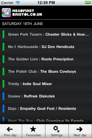
As pretty much everything for me revolves around music and variety of music I wanted to make a guidance application for what's going on in Bristol. You may have heard of
which I certainly took inspiration from but thought I could expand on the idea and make it better (if I had enough time that is).
HeadFirst is a useful application but it lacks the best design therefore can be a bit frustrating at times. To search for events you have to scroll through day by day. This means if you're looking for an event that is a few weeks away you're going to struggle with that. There is no way you can search for certain genre's or 'types' of clubs so for complete newcomers who aren't familiar with Bristol's popular venue's it can be fairly confusing. Personally I have sometimes spent a long time on the app and found nothing particularly helpful for what I've been looking for.
The good points are that it does separate club nights, live music and 'other event's quite nicely with its colour system (as seen in the picture on the right). There also seems to be some good technology behind the app allowing it to grab everything that's going on around Bristol and constantly updating itself.

Design - Colour scheme . . .
I wanted my design to be clear. I personally like simplistic applications using a white background. I find them easy to use if designed right and also clear and professional looking.
My plan was to have a white background, black text and gray/black buttons holding white text. After some small testing I found it to be clear, and easy to read both online and on my phone.
Above: Chosen colour scheme.
Design - Wireframes . . .
___________________________________________________________________________________________
With the colour scheme sorted I went on to draw up some 'wireframes' to get a feel of what the application would look like. I had a pretty solid idea of what I wanted from the get go so the designs I did are quite clear and reflect in my final application nicely. I'll explain what it will do after. Click the images for larger versions.
___________________________________________________________________________________________
What exactly do I want the application to do . . ?
As I stated I had a pretty clear idea of what I wanted to achieve. Hopefully the wireframes above shed a bit of light on that.
The idea of my application is to not JUST provide information with what's on around Bristol but to also add a randomise function. The amount of times I've seen people who are completely undecided on what to do with all the choices they have is huge and my app will aim to reduce that.
First off you will will either choose whether you want live music or a club night (the app can pick that for you too if you so wish). After this you will have the choice to view venues manually or again let the application run an algorithm and pick for you.

Hopefully the app will both add some fun and variety to what people will do when they go out. I have a personal love for variety of music and making sure I experience a wide range of things keeping my mind open. There are some problems with my idea though due to the need to some complex coding and also collaboration (let alone the time needed) that would have to be done for the idea to work 100%.
Ideally I would love for the application to have a login system and also allow the user to input what they have done. You would select what clubs/venue's you have been to and then log them. After logging them and seeing a trend it would be good if the application could pick an event for the user to go to based on their history and pick something similar or even completely different.
Slight Issues . . . Ideally not realistically . . .
___________________________________________________________________________________________
Alongside this there could also be a rating system, feedback giving users the ability to recognize what the best consistent night outs in Bristol are.
With a rating system I feel like in the end if the app were to be widely used it would push the venues of Bristol to a higher standard due to people tending to go only to the higher rated places.
Above is my start page with a log in bar and a user logged in. This is not included in my application for now as I have no idea how I'd achieve it.
To the left is the design of a venue page with a rating and feedback system. A user would be able to tap how many stars they thought the venue deserved and give their reasoning behind it. This could then be relayed to the official owners/organisers of an event.
Note: These designs are not working and are only concepts.
(Continue on to part two of my Mobile Development here)